
When we want to understand how things move from one stage to another — such as inputs being processed into outputs, or customers moving through a journey — a Sankey diagram is one of the most effective visualization tools. The width of each connecting line (called a link) represents the volume of flow, making it easy to see proportions at a glance.
In Plotly, these are called Sankey traces. Let’s explore what they are, why Plotly is a better choice than Matplotlib, how to prepare data for them, and how to implement one using Python code.
What is a Sankey Trace?
A Sankey trace is a diagram that maps nodes (entities) and links (flows) between them. The links vary in thickness according to the size of the flow. Common use cases include:
- Visualizing energy or resource transfers.
- Understanding process breakdowns.
- Tracking journeys or conversions.
This makes Sankey traces especially useful when there are multiple sources and outputs to compare.
Why Not Matplotlib?
Although matplotlib includes a matplotlib.sankey.Sankey class, its capabilities are limited:
- It supports only simple flows.
- It lacks interactivity.
- Customization is difficult.
By contrast, Plotly offers a go.Sankey object that is:
- Interactive → Hover to explore details.
- Flexible → Easy customization of labels, colors, and layout.
- User-friendly → Works smoothly inside Jupyter notebooks.
Choosing Data
For this simple example, we chose a simple flow – The GST revenues from various States in India to Central GST Aggregator. We took a snapshot of Aug-2024 data that is publicly available.
The dataset is downloadable from hugging faces or from github.
We used only a subset of data from this dataset to keep things simple. Here are the first few rows of the dataset.
	State/UT	        GSTAggregator	Aug-23	Aug-24
0	Jammu and Kashmir	Central GST	523	569
1	Himachal Pradesh	Central GST	725	827
2	Punjab	                Central GST	1813	1936
3	Chandigarh	        Central GST	192	244
4	Uttarakhand	        Central GST	1353	1351
Preparing Data for Sankey Traces
A Sankey diagram requires three components:
- Nodes: The entities (inputs, processes, outputs).
- Links: The connections between nodes.
- Values: The magnitude of each flow.
Let’s step through the process using code from the sankey_simple.ipynb notebook.
Step 1: Import Plotly
import plotly.graph_objects as go
We import plotly.graph_objects which provides the Sankey class.
Step 2: Define Nodes
# Extract all source and target nodes
nodes=pd.DataFrame(pd.concat([df['State/UT'], df['GSTAggregator']]).unique())

# Set column name for nodes
nodes.columns = ['node_name']
We extracted both source nodes and target nodes from two columns of the dataset.
Step 3: Define Links
# Prepare an index of all nodes
node_to_index = {node: idx for idx, node in enumerate(nodes['node_name'])}
# Create mapping for source nodes
df['sources'] = df['State/UT'].map(node_to_index)

# Create mapping for target nodes
df['targets'] = df['GSTAggregator'].map(node_to_index)
# Prepare data for sankey traces

labels = nodes['node_name'].tolist()
sources = df['sources'].tolist()
targets = df['targets'].tolist()
values = df['Aug-24'].tolist()
Explanation:
labels→ Labels for each node (both starting nodes and ending nodes).sources→ starting node of each link.targets→ ending node of each link. In our example, there is only one single (aggregator) target node.values→ size of flow along each link.
Step 4: Build the Sankey Trace
# Set sankey data
sankey_data = go.Sankey(
    # Configure the nodes in sankey traces
    node=dict(
        pad=50,
        thickness=40,
        line=dict(color="black", width=1),
        label=labels,
    ),
    # Configure the links in sankey traces
    link=dict(
        source=sources,
        target=targets,
        value=values,
    )
)
This creates the Sankey object with node labels and link definitions. The padding and thickness control spacing and node size.
Step 5: Create and Display the Figure
# Create the plotly graph object figure and add the sankey trace data
fig = go.Figure(data=[sankey_data])
# Update layout with proper height for a cleaner look; experiment with values that look best on your screen
fig.update_layout(title_text="India GST revenue from each state - Aug 2024 ", font_size=12, height=1000)
# Display the figure
fig.show()
Finally, we wrap the trace in a Figure and display it. In a Jupyter notebook, this produces an interactive Sankey diagram where you can hover over links to see details.
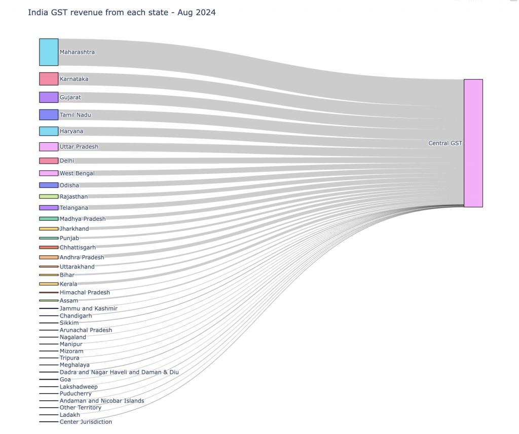
Results
Running this notebook produces an interactive Sankey diagram that shows how two inputs split into processes and then flow into outputs. The thickness of each link clearly represents the volume of transfer.
Result Visualization:
The following image shows a very simple visualization where there is a simple aggregating flow from multiple source nodes to a single target node.
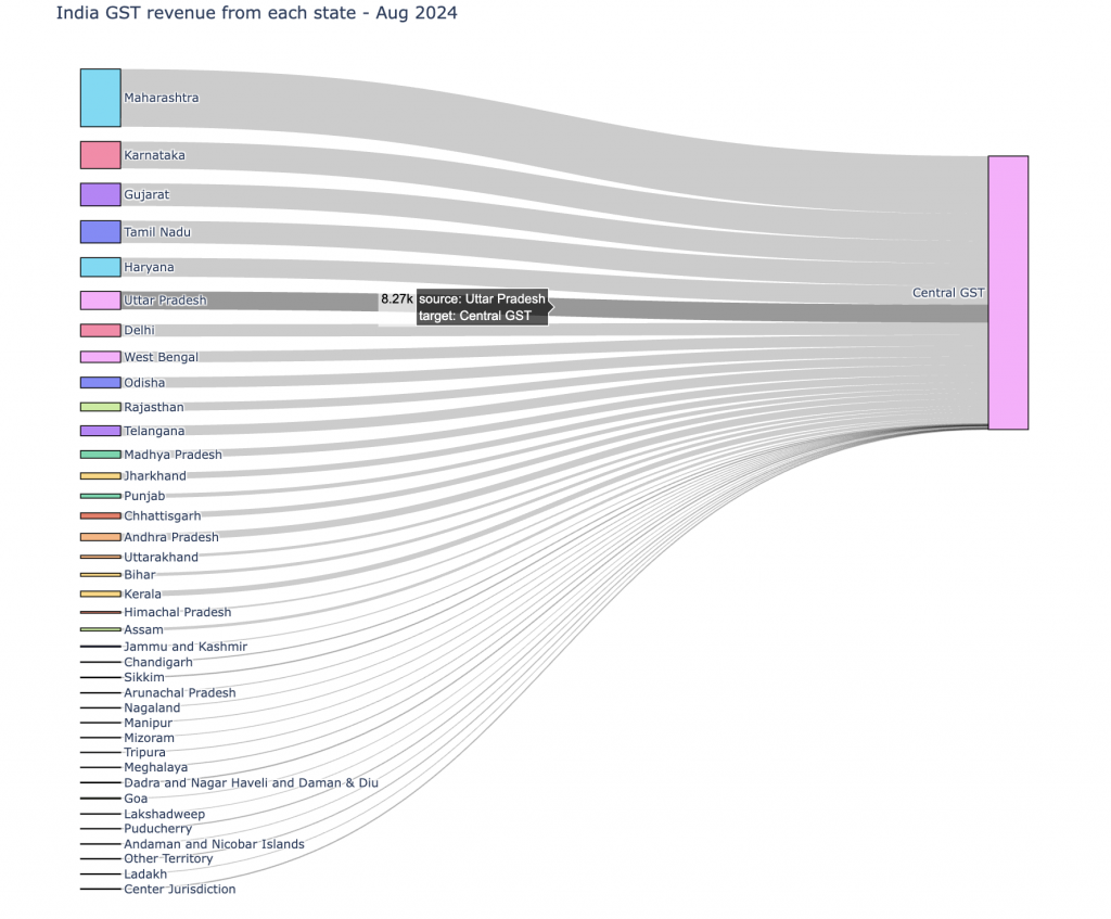
The plotly image generated in a Jupyter notebook presents the link specific data when we hover over any link.
Conclusion
Sankey traces are powerful for understanding flows in data. While Matplotlib provides only limited support, Plotly makes it easy to build rich, interactive diagrams. By structuring your data into nodes, links, and values, you can quickly generate insightful visualizations for processes, journeys, or systems.
If you’d like to try this out yourself, you can access the full notebook here: sankey_simple.ipynb.